
OHSU Foundation
Onward
Overview
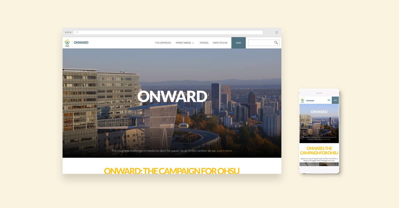
In October 2015, the OHSU Foundation launched the ONWARD: The Campaign for OHSU. The campaign will raise more than $2 billion for OHSU by 2020 to transform human health. The foundation is already more than halfway to its goal thanks to the Knight Cancer Challenge. Central to this effort would be a robust website that inspired donors and provided a secure and seamless giving experience. We were honored to be chosen to create this digital experience, one that would help them elevate their latest campaign to a full-on movement.
Solutions
Building on the resounding success of their Knight Cancer Challenge, the Foundation needed to maintain momentum with donors. Time was of the essence. This was no small challenge considering that we wanted to provide OHSU with a content-rich platform and for the many issues the campaign set out to address, from heart disease to children’s health–not just a static experience with a heavy push to donate.
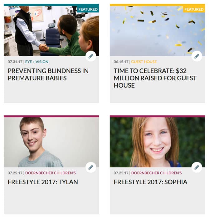
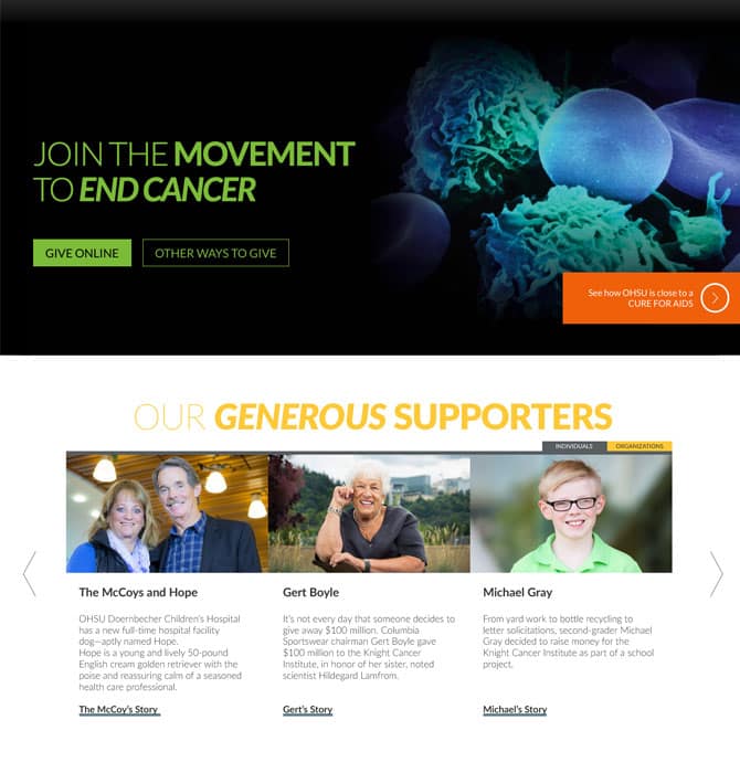
To help the foundation meet this ambitious target, we knew the ONWARD platform would need to emotionally engage donors through storytelling and relationships – through human connection. This is what’s so effective about in-person fundraising events, and why we set out to bring that experience online. As a result, the platform is packed with stories of researchers making key breakthroughs, and of the donors who help make the magic happen — from kids who raised money from lemonade stands to million-dollar donors.
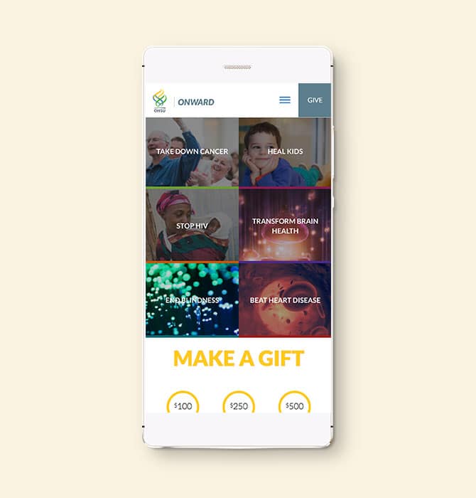
We understood that users would often be coming to the site not from the homepage but from an email or a blog post that dealt with a specific issue, so we created a flexible and modular design system that would allow them to navigate between stories without ever losing the platform’s overall theme. We needed to make sure it was easy for people to give to the area of health they wanted to support but also nudge them to explore the whole site. Subtle but significant design nuances throughout the site prompt users to explore and learn, creating an engaging and dynamic user experience. There are just too many amazing things going on right now at OHSU for us not to make every effort to get people hooked into the whole story.
OHSU is on the cutting edge, carrying the torch in so many different areas of medical research. As a result, things are constantly changing and evolving, so we knew the experience we were creating would need to be extremely scalable and flexible. We made sure to build things out in a way that would give OHSU the capability to make updates in real time without the site ever losing its integrity and structure.
Emerge delivered a website that met all of our requirements. Online fundraising has grown since the site’s launch, and users have praised its visually appealing look. Competitors have even tried to copy the site and emulate our success.
Shirley Skidmore Director of Strategic Communications, OHSU

Results
It’s a tall order being asked to create an experience worthy of representing such an amazing organization, and such important and inspiring work. Work that not only betters our community but that of all communities around the world. The culmination of efforts on both sides produced an experience that was at once flexible and robust and providing a thoughtful way for donorship to connect with the most critical element behind everything OHSU stands for—the human element.

Solving complex digital experience challenges
When you can’t afford to get it wrong we’re here to help you. We create smart products, web and mobile solutions.